Gymshark

Overview
We rebranded the YouTube channel of Ben Francis, the founder of Gymshark, designing a complete visual identity system from colour palette through to font, moodboard and thumbnail structure, so a billion pound brand finally had a founder channel that looked like one.
Details
Gymshark is one of the most disruptive brands of the last decade. A billion pound sportswear company that grew from a teenager filming gym content in his parents garage, becoming a serious challenger to Nike and Adidas. The brand exists because Ben Francis did things differently from everyone else in the space.
The problem was that his personal YouTube channel did not reflect that.
Ben had been creating content for years. The basics were in place. Decent thumbnails, reasonable images, real production effort. But there was no brand unity across the channel. Different videos had different vibes. The fonts were generic. The compositions did not build curiosity. There was no visual signature, which meant nobody scrolling YouTube could look at a thumbnail and instantly know it was a Ben Francis video.
For a billion pound company that originally grew through social media and YouTube content nearly a decade ago, this was a missed opportunity. The founder channel needed to feel like Gymshark. Premium. Modern. Different. Confident enough to walk its own path instead of borrowing the visual language of every other founder on the platform.
That is what we built.
What We Diagnosed First
Before we touched a single thumbnail, we ran a full diagnostic on the existing channel. The actual issues were specific.
- Inconsistency between thumbnails so the channel looked like five different channels stitched together
- Heavy use of generic fonts like Impact, which belong to the early YouTube era, not a billion pound brand
- Compositions that did not build curiosity or tell a story before the click
- No colour palette discipline, so the channel had no recognisable visual identity
- No visual signature that let viewers spot a Ben Francis video at a glance in the YouTube feed
The cost of all this was simple. Ben's videos were blending in with every other founder channel on YouTube. For a brand whose entire identity is built on standing out, this was the worst possible outcome.
The Contrarian Take On Founder Channels
Most founder channels at this level look exactly the same. Big bold yellow text. Arrows pointing at things. Shocked faces. Mouth open expressions. Loud, expressive, MrBeast adjacent thumbnails.
In our opinion, this is the worst thing a founder of a premium brand can do.
Founders at the top end copy each other relentlessly until every channel becomes a slightly worse version of someone else's playbook. The result is a sea of identical looking thumbnails, with no founder owning their own visual territory.
For a brand like Gymshark, we wanted the opposite. Clean. Modern. Raw. Premium. Sleek. Something that felt like the brand and felt like the founder. Not loud for the sake of loud. Confident for the sake of confident.
A founder channel should look like the company. If the company is premium, the channel should be premium. If the company is disruptive, the channel should disrupt the visual norms of YouTube. Gymshark grew by being different from Nike and Adidas. The YouTube channel needed to follow the same logic.
The Channel Identity System tm
This is the framework we ran for Gymshark, and it sits inside our wider Owen Creative System tm. The Channel Identity System tm is the visual identity layer of any channel build, and it runs in four stages before a single new thumbnail gets designed.
[Image placeholder: Branding deck cover page]
The deck above is a sample of the actual branding document we built for the project. We work through four sections in order. Each one informs the next.
1. Direction

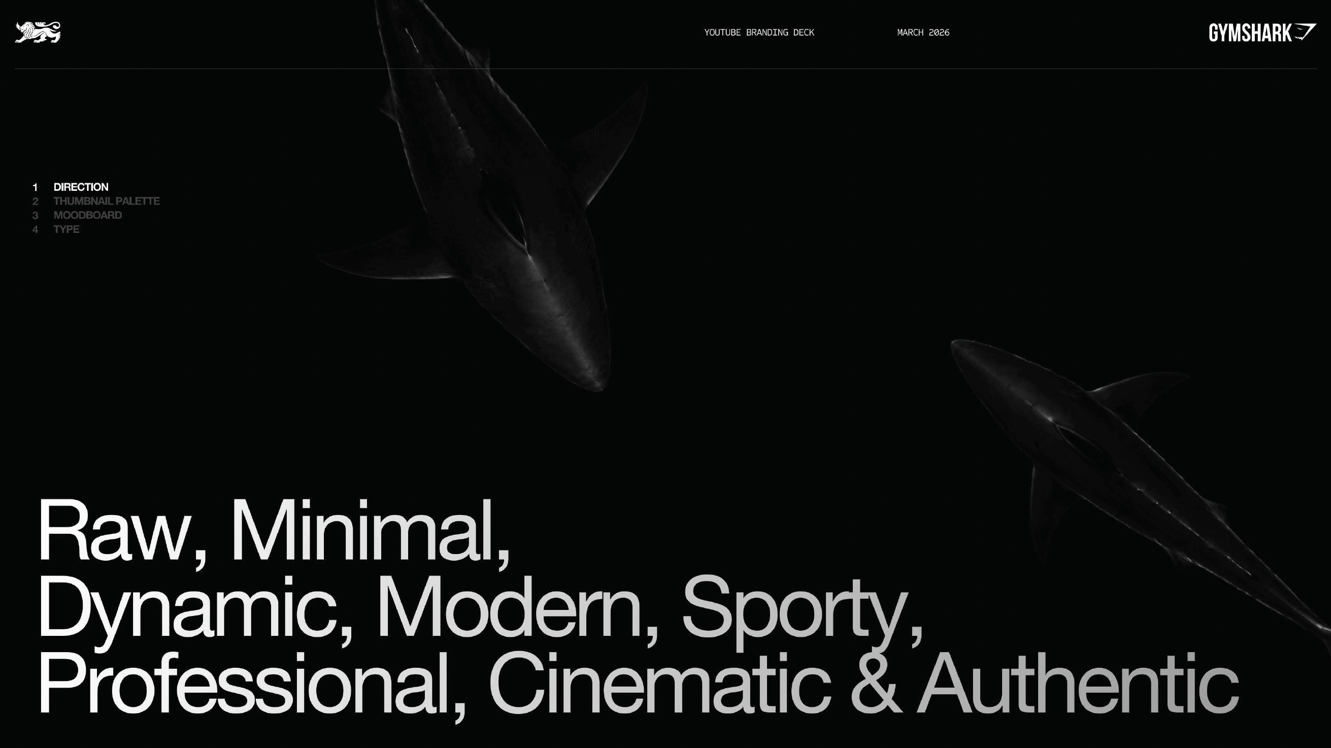
This is where we define the visual personality of the channel in a single line. For Gymshark, the direction was Raw, Minimal, Dynamic, Modern, Sporty, Professional, Cinematic and Authentic. Eight words that tell every designer, editor and thumbnail artist exactly what they are aiming for.
Without direction, you get inconsistency. Every designer interprets the brand differently, and the channel ends up looking like five channels. With direction, every output filters through the same creative lens.
2. Thumbnail Palette

Most YouTube agencies for personal brands skip this entirely. They treat colour as an afterthought. We treat it as a foundation.
For Ben's channel, we built a defined colour palette with named colours. Lipstick. Aqua. White. Iron. Cadet. Riverbed. Iridium. Black. Each one with a specific hex code. This means every thumbnail across the channel pulls from the same set, creating instant visual recognition over time.
When viewers see those colours in their feed, they think of Ben Francis. That is the entire point.
3. Moodboard

The moodboard comes before any thumbnail design because it informs the thumbnail design. We pulled visual references from premium brands like Dior, cinematic content, sporty editorial photography, and high end production stills. Anything that captured the feeling we wanted.
[Image placeholder: Moodboard page two with thumbnail examples]
We deliberately did not pull MrBeast style references or loud, expressive thumbnails. We wanted something cool, sleek and premium. The moodboard is the proof point that the visual direction is achievable. It shows everyone on the team what success looks like before any work begins.
4. Type

Single font. Single hierarchy. Used consistently across every thumbnail. We selected Clash Display, a variable font with a clean, modern, slightly editorial feel that matched the Gymshark brand without being generic.
Most channels use whatever font feels right that week. Big mistake. Font is one of the strongest visual signals on a thumbnail. A single, distinctive font used consistently for years builds brand recognition in a way nothing else does.
This was part of the full branding document we built for the project. The deck went deeper than what is shown above, but these four pillars are the foundation of everything we delivered.
Three Before And After Thumbnail Examples
Once the system was built, we redesigned thumbnails across the channel. Here are three examples that show the principles in action.
1. The Rise To Retail
Before:

After:

The original thumbnail used Impact font and looked generic. There was nothing about it that built curiosity or told a story.
Our redesign used a three part thumbnail structure. Ben in the middle as the present day version. A younger image of him on the left. The Gymshark product build process on the right.
The reason this works is because it tells the entire arc of the documentary in a single image. Past, present and product. Viewers see a transformation before they click, which is the single most powerful curiosity trigger on YouTube.
2. Designing A Gymshark Product From Start To Finish
Before:

After:
The original was busy and visually crowded. We stripped it back, applied the new font, used the defined colour palette, and built a composition that felt premium rather than chaotic.
The result is a thumbnail that looks like Gymshark. Not like a generic YouTube thumbnail with the Gymshark logo bolted on top.
3. How A Billion-Dollar CEO Spends His Week
Before:

After:
.png)
The before and after on this one is the clearest example of the system in action. The original had no visual identity. The redesign is cleaner, builds more curiosity, tells a story, its more confident, and instantly recognisable as part of the same channel as the other videos.
This is what consistency does. Each thumbnail reinforces the next. After enough videos, the channel develops a visual signature that is impossible to fake or copy quickly.
Why A Billion Pound Founder Cares About This
Ben Francis runs a billion pound company. He could ignore his YouTube channel entirely. So why does this matter?
In Ben's own words, he is building a 100 year vision. He wants his children to look back at these videos and watch how he scaled this company. YouTube is the only platform where that documentation actually lives forever and stays watchable.
Founders at this level still have to play the YouTube game. They cannot afford to blend in or look like every other entrepreneur on the platform. The companies they built grew by being different. The personal channels they run should follow the same logic.
Gymshark disrupted Nike and Adidas by refusing to look or feel like them. The YouTube channel needed to disrupt the founder channel norms in exactly the same way.
Scope Of Work
- Full channel diagnostic and audit
- Visual direction and brand pillars
- Colour palette design and naming
- Moodboard and creative reference development
- Font selection and typographic system
- Branding deck and creative guidelines
- Thumbnail redesign across selected videos
- Title rework and creative direction
- Ongoing creative system handover
Results
This was a channel revamp. We did not produce the videos themselves, so we are not claiming view results that are not ours. What we did deliver is a complete visual identity system that gives Ben Francis and the Gymshark team a foundation to build on for the next decade of content.
A founder channel that finally looks like the brand it represents.


